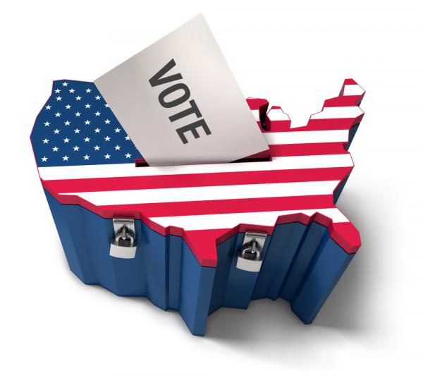
Nobody Leads a Presidential Race by Percentage Points: Look for the Electoral Map
Barack Obama 49%, John McCain 44%.
News items like this one from CNN.com on September 2, 2008 greet us every day during presidential campaigns. Nevertheless, news based upon national public opinion polls can only mislead citizens, candidates and other observers of presidential campaigns. Because such messages rely upon the wrong kind of data they can neither project the election's likely outcome or communicate responsibly the campaign's status. Fortunately, reporters can easily correct this fundamental reporting error, and each of us can access the appropriate data for ourselves.
For example, the table below demonstrates a clear instance of how the media's reporting of poll results can confuse or conceal what is really happening in the presidential campaigns. On August 28, the day after Barack Obama's acceptance speech at the Democratic National Convention, Real Clear Politics reported the closeness of the two candidates in the U.S. presidential campaign:
|
Poll |
Date |
Obama (D) |
McCain (R) |
Spread |
|
Real Clear Politics Average |
August 18-28 |
47.7 |
43.8 |
Obama + 3.9 |
|
Gallup Tracking |
August 26-28 |
49 |
41 |
Obama + 8 |
|
Rasmussen Tracking |
August 26-28 |
49 |
45 |
Obama + 4 |
|
CNN |
August 23-24 |
47 |
47 |
Tie |
|
USA Today/Gallup |
August 21-23 |
48 |
45 |
Obama + 3 |
|
Hotline/ |
August 18-14 |
44 |
40 |
Obama + 4 |
|
ABC News/Wash Post |
August 19-22 |
49 |
45 |
Obama + 4 |
Source: Retrieved August 28, 2008, from http://www.realclearpolitics.com/polls/
Polls like these provide the basis for news stories, such as “The Gallup daily tracking poll showed Barack Obama and John McCain tied at 44 percent Friday for the third time in two weeks.”
The problem is that national opinion polls project the national popular vote that does not count for anything meaningful under the Constitution's procedures for selecting the next president of the United States. CNN and Real Clear Politics are just two of the sites that provide remarkably elaborate but inadvertently deceptive reports of these meaningless data.
Anyone interested in who is leading the race for the presidency needs to know which candidate is leading in the race for Electoral College votes. Each state has a number of electoral votes equal to its number of U.S. Representatives plus Senators, and all of its electoral votes go to the candidate who wins in that state. Therefore one cannot possibly learn anything about the state by state voting that will determine electoral votes from national preference data, but these types of polls remain the stock and trade of most media stories about the likely outcome of presidential elections.
State poll data relevant to Electoral College outcomes are readily available to all of us, but they remain underutilized by the campaign press and the public. The Hotline (now a service of the National Journal) began providing these data in 1984 as the Thursday afternoon “Scoreboard.” In 2004 VotefromAbroad.org started a web site that posted state polls and a shaded electoral map. Rasmussen Reports and Pollster dot com began providing these data in 2008, and The New York Times and CNN have recently added electoral maps to their sites.
VotefromAbroad.org shows the national map with the states divided into seven categories. Rolling one's mouse over a state pulls up the poll numbers used to classify the state's status as well as the state's presidential percentages in 1992, 1996, 2000 and 2004. A banner across the top shows the overall tally (on August 29, 2008 it was Obama 278, McCain 247, Ties 13). Clicking Electoral College graph takes the viewer to a line graph of daily projections, which are demarcated by notable campaign events.
Pollster dot com also uses a national map to display its state poll result. But unlike VotefromAbroad.org, Pollster dot com reports only five categories of states: “strong” and “leaning” Republican and Democratic states, and “tossup” states. Rolling the mouse over a state reveals the recent poll margin, but not the archival data available from VotefromAbroad.org. Importantly, Pollster dot com's expanded tossup category provides a more cautious reading of the likely outcome than does VotefromAbroad.org (Democrat 260, Republican 176, and 102 Tossup on August 29, 2008).
Even more cautious is the State by State Balance of Power table at Rasmussen Reports. But it takes a notably different approach to the display of its results by foregoing the traditional map in favor of a table. VotefromAbroad.org grants a state to a candidate unless it is a statistical tie, but Rasmussen only grants the candidates those states that are either “safe” or “likely”--“leaners” remain among the “tossup” states. Thus Obama's lead of 278-247 in VotefromAbroad.org and 260-176 in Pollster dot com shrinks to 193-183 in the Rasmussen summary on September 19th.
The Rasmussen Reports, which is regularly updated, presents data in a tabular format that allows us to track the battleground states in their historic context. Although we can see the battlegrounds on other sites' maps, the three middle columns of the Rasmussen table (below) show which states are shaping up as the 2008 battleground states that will decide the election. Two Republican states (Iowa and New Mexico) lean Democratic and all of the tossup states (Nevada, Colorado, and Virginia) have recently voted Republican, while no Democratic state currently leans Republican.
|
Leans GOP |
Toss Up |
Leans Dem |
|
OR (7) |
||
|
WI (10) |
The shift from the meaningless national percentages to projected electoral votes misleads by implying that the outcome hinges on the statistical margin of the national vote. A news report suggesting that “The race is now only a couple percentage points and likely to be a very close election,” is nothing more than sloppy reporting and does not deserve our trust.
A reporter using state-level data available on September 19th from Rasmussen Reports could report that John McCain seems able to count on 200 electoral votes from states in which polls show either “safely” or “likely Republican” while Barack Obama seems able to count on 193 electoral votes from states that are either ”safely” or “likely Democratic.” That reporter would then be able to explain that the outcome would be close because neither candidate could be confident of the 270 electoral votes required to win.
A reader using the Rasmussen Reports data can see not only why the election may be close, but where the candidates need to win support. The McCain campaign leads Obama by seven electoral votes, but must take the lead in states accounting for 70 more without losing any in order to win. Florida and Ohio leaned his way on that day, providing hope for 47 of the necessary 70 votes. That means that the most likely path to a McCain victory would involve his need to win 23 of the 32 electoral votes at stake in the “Toss-up” states: Colorado (9), New Mexico (5), Nevada (5), and Virginia (13). All of those states have voted Republican in recent presidential elections.
The Rasmussen table suggests that Obama trails McCain by 7 electoral votes, but holds modest leads in six states accounting for 66 electoral votes “leaning” his way. If Obama can take all of those states he would have 259 and then need 11 votes from the “toss-up” states that have voted Republican in recent presidential elections: Colorado (9), New Mexico (5), Nevada (5), and Virginia (13).
It is important to note that all of the electoral maps classify states on the scale of “safe” to “toss-up” based on the closeness of the state's recent polls. National campaigning, international events and domestic developments as well as campaign related trivia can all contribute to changes in voters' candidate preferences. Today's 24-hour news coverage assures us of many such news stories before Election Day. As they unfold, only electoral maps can track the movement of states from the ”toss-up” column to “leaning” column and thereby help us to understand the campaign in its Constitutional context.
While it may appear that presidential candidates campaign for your vote, the U.S. electoral system positions them as campaigning for electoral votes distributed according to the population of each state. In the final analysis, which candidate wins which states is more important than who wins the national popular vote, as Al Gore learned in 2000. But news stories about the campaign too often mislead us by reporting national opinion polls that are simply irrelevant. One of the promises of the Information Age was that we would all be better informed. Too often we have been merely better misinformed because we have fallen victim to a kind of Gresham's law of information, in which cheaper information drives better information from the marketplace of ideas. Fortunately, when it comes to tracking the progress of presidential campaigns, reporters and citizens alike can bookmark sites like VoteFromAbroad.org, Pollster dot com, and Rasmussen Reportsto access this information.
Postscript November 7, 2008
This week's election provides an opportunity for us to see how the electoral map approach worked. The table below presents the projections from the major sites as well as the final outcome. All five electoral map sites correctly predicted a comfortable Obama victory. The results show that Electoral-vote.com's projection came very close to the final result, missing only Indiana where Obama won by 1% despite a late 2% lead for McCain. The 538.com site also missed Indiana and balked at projecting Obama in North Carolina because their model showed him winning in only 59% of their tests. Like 538.com, Electionprojection.com, Pollster dot com and Rasmussenreports.com all proved overly cautious, underestimating the ability of Obama's operations to turn out voters in Ohio, Florida, and Virginia.
|
|
Obama |
Margin |
McCain |
|
Actual Outcome |
364 |
202 |
162* |
|
Electoral-vote.com |
353 |
179 |
174 |
|
538.com |
348.6 |
159.2
|
189.4 |
|
Electionprojection.com |
338 |
138 |
200 |
|
Rasmussen Reports.com |
286** |
126 |
160 |
|
Pollster dot com |
291 |
149 |
142 |
*Missouri (12 Electoral Votes) remains too close to call **includes Leans Democrat
The 2008 presidential election supports the practical utility of using electoral maps rather than the national percentage polls to track the status of the campaign. Nevertheless, those accustomed to the national polls may reasonably raise three objections.
One reasonable objection to the use of state level polls could be that they are less carefully conducted than the national polls, and, therefore, less accurate. To test this, I borrowed the Rasmussen Report's tabular format and updated it daily for the last ten days of the campaign using the data available from Electoral-vote.com. I categorized a state as safe if the poll indicated a lead of 12% or more, likely if it reported a lead of 6%-11%, and a tossup if it reported a lead of 5% or less. The choice of 5% reflects the presence of the poll's statistical margin for error as well as the campaigns' intensive, but unequal, efforts to encourage their supporters to vote.
The results are reported in the table below. States that previously voted for George W. Bush (Republican) appear in lower case, while states that voted for John Kerry (Democrat) appear in upper case. The state polls projected 278 safe and likely electoral votes for Obama and 132 for McCain--enough to determine the outcome. All of those projections proved accurate. The polls could be pushed further to suggest that Obama could win every state were he led by 1% or more in the polls, and he won all of them. McCain could harvest an additional 53 electoral votes by winning the states where he led by 1%. McCain did all of this, with the exception of losing Indiana. In short, the state polls correctly predicted the outcome of 48 of the 49 races in which they identified a leader, as well as the virtual tie in Missouri.
|
Safe |
Likely |
Possible |
Possible |
Likely |
Safe |
|
GOP |
GOP |
GOP Toss Up |
DEM Toss Up |
Dem |
Dem |
|
(12-36%) |
(6-11%) |
(-5% to 0%) |
(0% to +5%) |
(6-11%) |
(12-69%) |
|
(70 electoral votes) |
(62 electoral votes) |
(53 electoral votes) |
(55 electoral votes) |
(60 electoral votes) |
(218 electoral votes) |
|
|
|||||
|
|
|||||
|
|
DC (3) 69% |
||||
|
|
HI (4) 41% |
||||
|
|
|||||
|
|
|||||
|
|
|
|
|||
|
|
|
|
|||
|
|
|
|
|||
|
|
|
|
|
||
|
|
|
|
|
||
|
|
|
|
|
|
|
|
|
|
|
|
|
|
|
|
|
|
|
|
|
|
|
|
|
|
|
|
|
|
|
|
|
|
|
|
|
|
|
|
|
|
|
|
|
|
|
|
It might also be argued that news outlets employ the national percentage polls because they provide a handy way to report the daily tracking of the campaign's progress. Indeed, some of the electoral maps are revised only weekly (and Rasmussen seems not to have revised theirs at all during October). But I found it simple enough to track the changes daily for the last two weeks of the campaign using Electoral-vote.com's “New Polls Today” list.
|
|
OCT 29 |
OCT 30 |
OCT 31 |
NOV 1 |
NOV 2 |
NOV 3 |
NOV 4 |
|
Safe GOP |
70 |
70 |
62 |
70 |
70 |
70 |
70 |
|
Likely GOP |
62 |
72 |
70 |
62 |
62 |
62 |
62 |
|
GOP Electoral Votes |
132 |
142 |
132 |
132 |
132 |
132 |
132 |
|
Tossup |
95 |
88 |
95 |
95 |
95 |
108 |
128 |
|
DEM Electoral Votes |
311 |
311 |
311 |
311 |
311 |
298 |
278 |
|
Likely DEM |
100 |
56 |
87 |
90 |
83 |
80 |
60 |
|
Safe DEM |
211 |
255 |
224 |
221 |
228 |
218 |
218 |
|
|
Actual Outcome |
|
Safe GOP |
70 |
|
Likely GOP |
62 |
|
GOP Electoral Votes |
174 |
|
Tossup |
|
|
DEM Electoral Votes |
364 |
|
Likely DEM |
60 |
|
Safe DEM |
218 |
The tables above show that while McCain's projected electoral votes remained in the 132 to 142 range, Obama's grew from 277 to 317. When the McCain camp said that the race was narrowing in the closing days of the campaign they were not wrong, but the table shows that they were correct only in the sense that Obama's safe and likely electoral votes dropped from 317 to 298--still 28 more solid states than he would need to win; no tossup electoral votes were moving to McCain.
The third objection that advocates of national polls might raise is that their polls, too, were accurate. In this case 538.com came remarkably close, predicting 52.3% for Obama (he got 52.6%) and hitting McCain's 46.2 % on the button. Nevertheless, the popular vote still does not determine the outcome of a presidential election. Moreover, the accuracy of the prediction belies the wild variations of the popular vote in various states. For example, McCain won more than 60% of the votes in Wyoming, Utah, Idaho, Oklahoma, Alabama, and Hawaii; Obama won more than 60% in Vermont, Massachusetts, Connecticut, Maryland, Delaware, DC, Hawaii, and in three of the largest states (California, New York, and Illinois). In short, the finally tally may have turned out to be 52%-46%, but the outcome of the election would have been entirely different if it had been McCain who won 60% of the votes in California, New York, and Illinois on the way to that national percentage.
In conclusion, the 2008 election provides us with additional reasons to consult electoral maps instead of national polls to keep track of the progress of presidential campaigns. Perhaps more news outlets will adopt this practice in 2012. But even if they do not, we can easily bookmark the web sites ourselves.